3 COMMON WEBSITE MISTAKES WE SEE ALL THE TIME
AND THEY'RE ALL FIXABLE
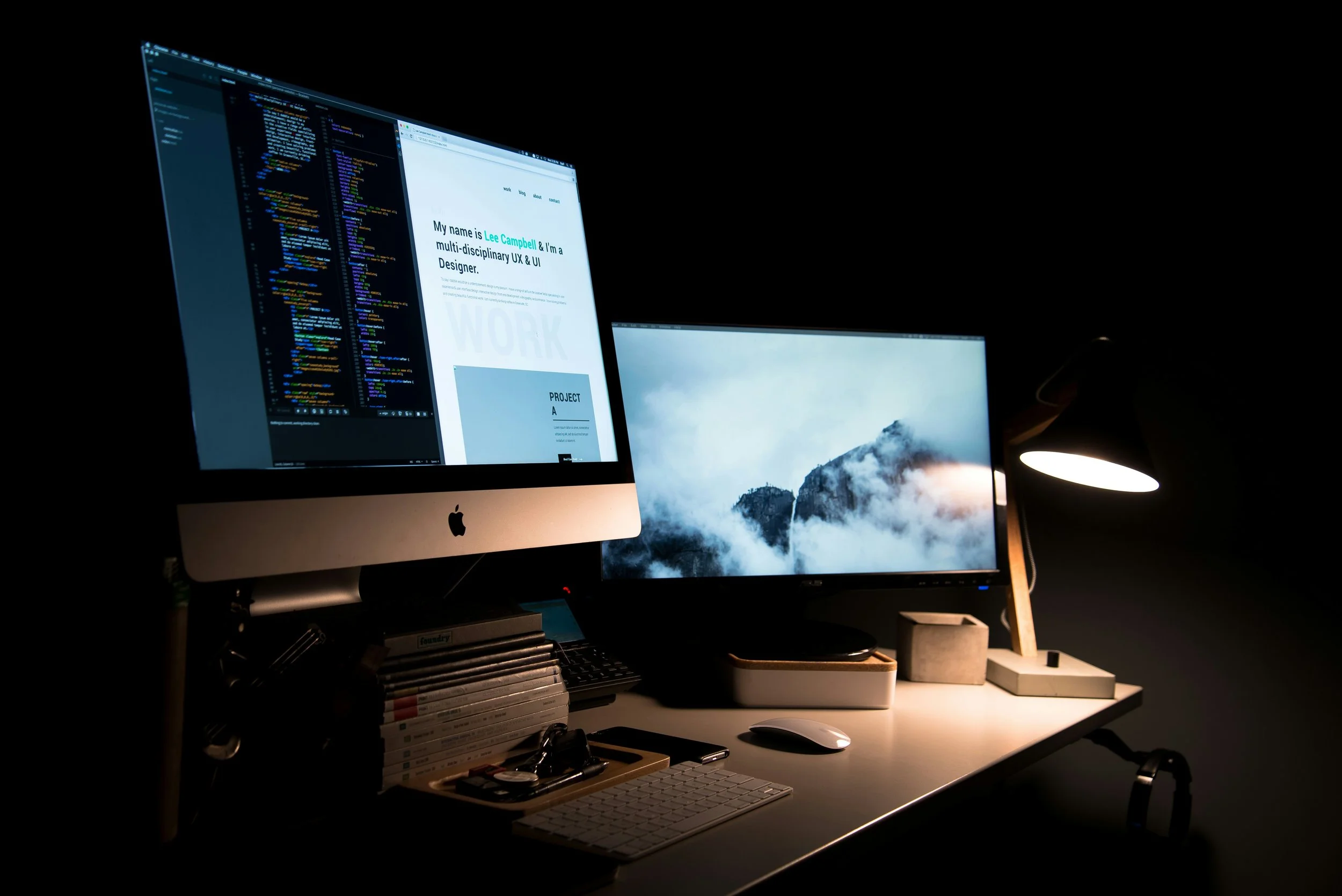
Photo by Lee Campbell on Unsplash
We review a lot of websites. Small businesses, creative agencies, service providers — across industries and budgets. And while every site is different, we keep seeing the same three problems come up again and again. The good news? None of them is hard to fix. You just have to know what to look for.
MISTAKE #1: YOUR WEBSITE IS TOO SLOW
Speed isn't a nice-to-have — it's a dealbreaker. When someone clicks a link to your site, you have about three seconds before a significant portion of them give up and leave. Not because they're impatient, but because the internet has trained them to expect instant responses. A slow site signals — consciously or not — that something is off.
The culprits are almost always the same: oversized images that were never compressed, too many plugins running in the background, cheap shared hosting that throttles your performance, and no caching or CDN in place. None of these is an exotic problem. They're entirely fixable, and fixing them often takes less time than you'd expect.
THE NUMBERS:
53% of mobile visitors abandon a site if it takes more than 3 seconds to load. A single extra second of delay can reduce your conversions by up to 20%. Only 57.8% of websites currently pass Google's Core Web Vitals speed benchmark. And improving load time by just 0.1 seconds can lift conversions 8.4% for retail sites. The irony is that most business owners have no idea how slow their site actually is. They've been looking at it for months on a fast laptop connected to Wi-Fi. Their visitors are often on mobile, on a marginal connection, and in a hurry. The experience is completely different — and completely avoidable.
THE FIX:
Run your site through Google PageSpeed Insights (free) — aim for a mobile score of 90+
Compress and convert all images to WebP format — this alone can cut load time dramatically
Remove unused plugins; each one adds weight even if it's deactivated
Enable a CDN (Content Delivery Network) — Cloudflare has a free tier and can cut global latency by 30–60%
MISTAKE #2: THERE'S NO CLEAR CALL-TO-ACTION
Visitors don't explore websites the way you might think. Most of them land, scan for about 15 seconds, and either find a reason to act — or they leave. If your homepage doesn't have a single, obvious next step, most people will take none at all. Not because they weren't interested, but because they weren't told what to do.
We regularly see sites with four or five competing buttons ("Learn More," "About Us," "See Our Work," "Contact," "Get a Quote") — all shouting for attention at the same volume. The result is the visual equivalent of a crowded room where everyone's talking at once. The visitor mentally checks out.
THE NUMBERS:
A clear, specific CTA can increase conversion rates by 161%. Reducing to ONE primary CTA per page can boost conversions by 266%. Using action words (Get, Book, Start, Request) increases click-through by 122%. And personalized CTAs perform 202% better than generic ones. The most effective CTAs aren't clever — they're clear. "Book a Free 20-Minute Call" outperforms "Let's Chat." "Get Your Free Quote" outperforms "Contact Us." Give people a specific, low-friction next step, and you'll be surprised how many take it.
THE FIX:
Pick one primary CTA per page — everything else is secondary
Use action verbs: "Book," "Get," "Start," "Request," "Download" — never "Click Here"
Make your CTA button visually unmistakable — contrasting color, clear size, white space around it
Place it above the fold on both desktop and mobile — don't make people scroll to find it
Link it to the right destination — a quote form or booking page, not a generic homepage
MISTAKE #3: YOUR HOMEPAGE DOESN'T CLEARLY SAY WHAT YOU DO
This is the one that surprises people most when we point it out — because the business owner always knows what they do. Of course they do. They built the thing. But visitors arrive as strangers, and they're making a snap judgment within seconds of landing on your page: Is this for me? Can this person help me?
Too many homepages lead with the agency's story, their values, their journey. Those things matter — but they're not what a new visitor needs first. What they need first is clarity: here's who we help, here's what we do, here's why you should trust us. The "about us" content can come second.
THE NUMBERS:
Across a study of 100+ small business websites, the most common issue was vague or overly clever messaging that prioritized cleverness over clarity. Copy that uses "you/your" more than "we/our" consistently connects better with visitors and improves conversion. Simplifying landing pages can increase conversions by over 180%. The other piece that's almost always missing: social proof. A potential client lands on your site after seeing a referral or a social post. They're interested — but interest alone doesn't become a phone call. Trust does. And trust comes from seeing that other real people have worked with you and been glad they did. Testimonials, client logos, case studies — even a single well-placed quote — change the entire character of a homepage.
THE FIX:
Write your hero headline using this formula: [Who you help] + [What outcome you deliver] — in plain language, no jargon
Audit your copy: count "you/your" vs. "we/our" — the first should win by a mile
Add at least one testimonial or client result above the fold — not buried at the bottom
Label your services in plain, searchable language ("Video Production" not "Visual Storytelling Solutions")
Build a portfolio or case study section that shows the work, not just describes it
Not sure which mistakes your site is making? We do free website reviews for businesses in the Worthwhile Media network. A 20-minute conversation can surface all three — and give you a clear fix-it roadmap.
Visit us to book your free review.